Geospatial Visualization: Leverage It for Business Growth
Geospatial Visualization: Leverage It for Business Growth
October 9, 2023
Guides
Author: Volodymyr Ovramenko
Reading time: 11 minuntes
Are you seeking state-of-the-art technologies for location-based data analysis? Geospatial visualization can take your business to a new level. You can use sophisticated mapping technologies to uncover the potential of location-based information to improve decision-making, streamline operations, and gain a competitive edge. Whether you’re a marketer, a retailer, or a logistics expert, this article will show you how to leverage geospatial visualization to reach unprecedented business growth.
What Is Geospatial Visualization?
Geospatial data visualization is a technique for displaying geospatial data on a map. This practice is based on the interactive visualization of traditional maps for a better understanding of spatial relationships and patterns. Geospatial visualization tools help users create interactive maps, graphs, 3D models, and other visualizations to analyze geospatial data meaningfully. They range from basic mapping software to more sophisticated systems that provide geospatial insights.
Geospatial visualization is applied in many fields, such as transportation, urban planning, agriculture, environmental monitoring, and emergency management. Geospatial data visualization helps companies identify and capitalize on market opportunities in business. Retail chains and logistics companies use geospatial visualization to place new stores in areas with high customer density and optimize their delivery routes.
There is also geospatial information visualization and extended reality displays, which use immersive technologies such as virtual reality and augmented reality to visualize and interact with geospatial data in three dimensions.
Advantages of Geospatial Visualization
In this section, we’ll explore the advantages of geospatial visualization to help your business grow.
Better decision-making: geospatial visualization enables businesses to better understand complex information and make informed decisions. They can quickly see patterns and trends and assess the impact of different variables by visualizing data in a spatial context.
Increased efficiency: geospatial data visualization can help identify areas of opportunity or areas that require attention more quickly and efficiently than traditional methods. You can save time and cost by automating data processing and analysis.
Identification of patterns and trends: geospatial visualization and analysis can reveal patterns and trends that might not be apparent in traditional tabular data. This can lead to new insights and discoveries, which can be used to inform decision-making.
Improved understanding: geospatial visualization virtual reality helps people better understand complex spatial relationships and patterns and identify trends that are not obvious from tabular or textual data.
Enhanced communication: businesses can communicate complex data to stakeholders more engagingly and interactively. This facilitates collaboration and understanding of the technical details.
Improved customer experience: geospatial visualization can help businesses better understand their customer’s demands. Data mapping visualization is a great solution to identify patterns and trends in customer behavior and gain insights to enhance their experience.
How Geospatial Visualization Works?
Let’s focus on its principles to better explain the concept of geospatial visualization. Here is a step-by-step guide on how geospatial visualization works:
Data collection: The first step in geospatial visualization is to collect the necessary data. This could be in the form of satellite images, GPS coordinates, demographic data, or any other relevant information.
Data preprocessing: Once the data is collected, it needs to be preprocessed to ensure it is ready for visualization. This may include cleaning the data, transforming it into a suitable format, and ensuring it is georeferenced.
Selecting a visualization tool: Many geospatial visualization tools are available, ranging from open-source programs to specialized applications. You should consider the type of data, the amount of interaction, and the target audience when deciding which tool to choose.
Choosing a visualization method: There are various geospatial visualization methods, including choropleth maps, heat maps, scatter plots, and 3D geospatial visualization. The type of data being visualized, the required information level, and the target audience will determine the technique to use.
Applying the visualization technique: Once the technique is chosen, it needs to be applied to the data using the chosen visualization tool. This may involve selecting appropriate colors, setting the scale, and adjusting other parameters to ensure the resulting visualization accurately represents the underlying data.
Iterative refinement: Geospatial visualization is an iterative process, and it is important to refine the visualization as needed to ensure that it is clear, accurate, and effective in communicating the intended message.
Sharing the results: You should share the results of the geospatial map visualization with the target audience. To do that, you can generate static maps or interactive visualizations to display information in detail.
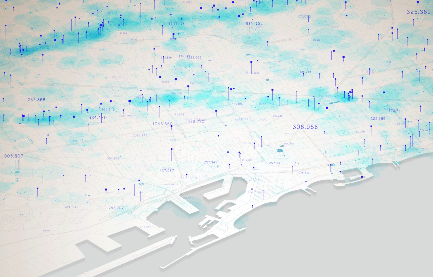
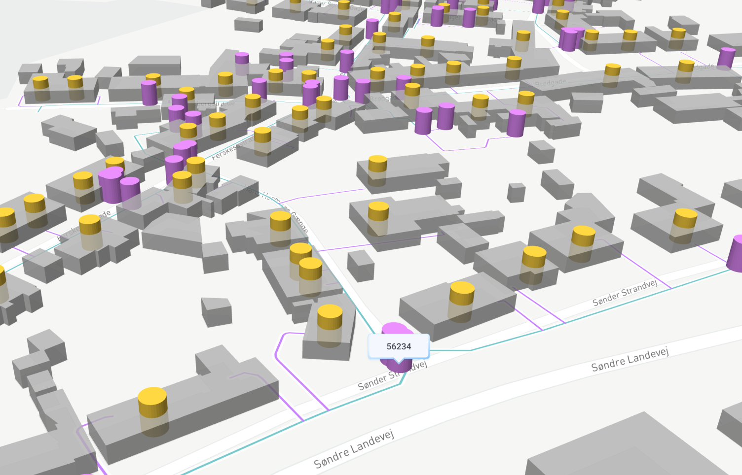
Here is an example of 3D urban geospatial visualization.
Libraries Used for Visualizing Geospatial Data
Libraries help create maps and other visualizations of geospatial data. They provide different functions, such as handling geospatial data formats, displaying maps and data overlays, and providing interactive features for data exploration. You can benefit from geospatial data visualization Python, JavaScript, or the Google Maps API.
Geospatial visualization Python includes Folium, Plotly, Kepler GL, IpyLeaflet, Geopandas, and HoloViz. These are examples of the best geospatial data visualization tools in the Python ecosystem. Popular JavaScript libraries include Leaflet, D3.js, Mapbox, and OpenLayers. These are powerful and open-source libraries for creating customizable and interactive maps.
Methods for Visualizing Geospatial Data
A data mapping visualization is a specific technique or approach used to represent geographic information visually. They display different types of information about geographic features, such as location, quantity, density, and spatial relationships.
Point Map
A point map is a type of geospatial visualization that represents individual locations as points on a map. To convey more information, each piece of data is represented as a point or marker on a map with various colors and sizes. Point maps have applications in many areas, including marketing, transportation, and urban planning.
Choropleth Map
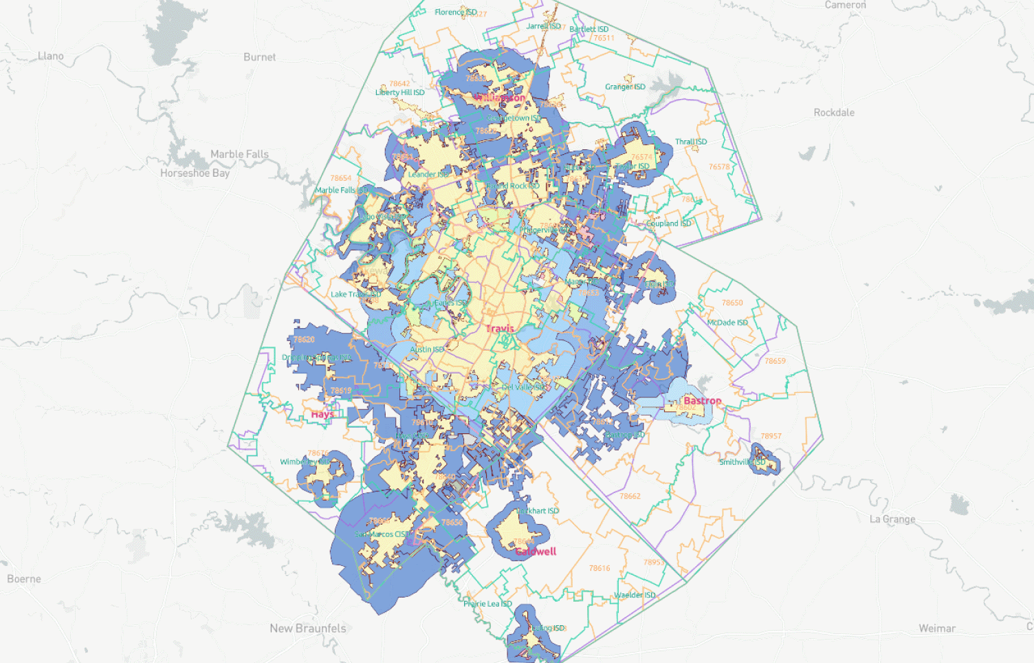
A choropleth map visualizes data by filling certain areas with boundaries in a different color or shade. These may be geographic or political boundaries of counties, states, etc. The application of choropleth maps is found in economics, public policy, epidemiology, etc., to display and study demographic or socioeconomic data.
Cluster Map
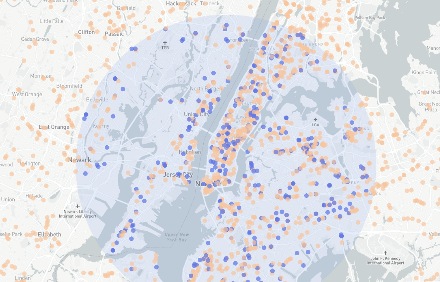
Cluster maps group nearby data points into clusters represented by a marker on the map. If there are many overlapping points in a large dataset, this visualization method will facilitate trend and pattern identification within the data. Real estate, transportation, and retail businesses can benefit from the clustering technique, grouping similar data points.
Heat Map
Using color gradients, a heat map is a temporal data geospatial visualization technique representing different point values, density, and intensity across a geographic region. Heat maps visualize large datasets with overlapping points and a high degree of variability. They visualize data patterns and trends in marketing, business, transportation, public health, etc.
Proportional Symbol Map
A proportional symbol map uses symbols of different sizes to display data values for specific locations. The size of a symbol determines the variable value. This map type shows the relative magnitude or quantity of data at specific locations. It can identify spatial patterns and trends in the data. You can use this map to visualize population density, crime rates, or economic indicators.
Cartogram Map
A cartogram map distorts the shapes and sizes of geographic regions to represent a particular variable more meaningfully. This map shows the data by resizing or reshaping the geographical area and is similar to a choropleth map. It can be useful for comparing data between regions and getting valuable insights that are unclear from a traditional map.
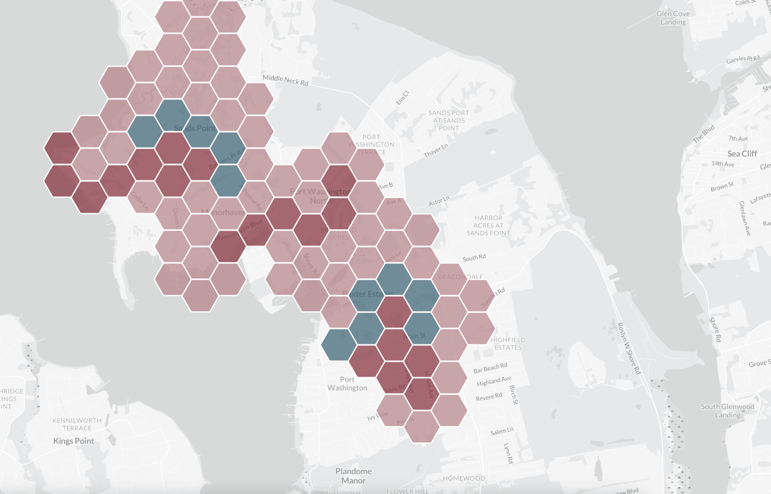
Hexagonal Binning Map
A hexagonal binning map divides the map into hexagonal bins, where each bin is colored according to the number of points it contains. It allows users to see general data trends and patterns. The hexagons are sized based on the points’ density.
H3: Topographic Map
Topographic maps display the physical and natural features of areas. These are mountains, valleys, rivers, forests, roads, and buildings. Contour lines represent changes in elevation and relief. You can use it for outdoor activities, urban planning, and resource management.
Spider Map
A spider map displays multivariate data in the form of a two-dimensional chart. A series of axes emanate from a common origin point and display data across multiple variables. Each axis represents one variable. These maps are useful for comparing multiple sets and are commonly used in business and marketing.
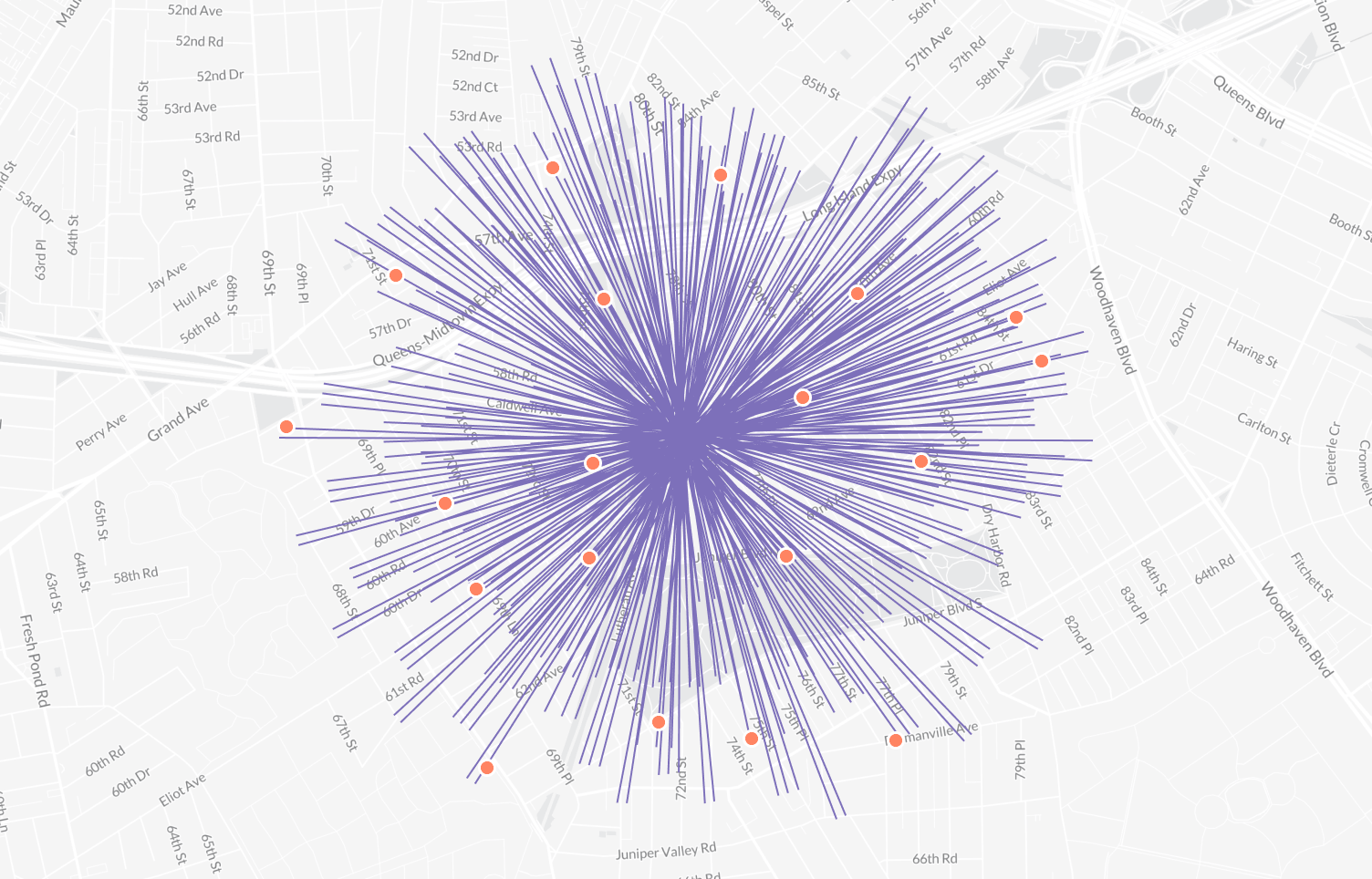
Flow Map
A flow map shows the movement of objects or entities over time. When displaying movement volume and direction on flow maps, arrows or lines of various thicknesses and colors are used. It represents the flow of people, goods, or information between geographic regions, for example, vehicle traffic or weather patterns.
Time-Space Distribution Map
A time-space distribution map is a form of geospatial temporal data visualization that shows the distribution of events or phenomena over time and space. It shows the position of an object as it moves at any given time. This type of non-static mapping can be applied to various events, including traffic accidents, disease outbreaks, and natural disasters. It can be useful for identifying event patterns and trends and their subsequent management, such as analysis and resource allocation.
How to Adopt Geospatial Data Visualization?
There are a few simple steps to adopt geospatial data visualization and create customized visualizations in Leaflet. The first thing to do is choose a geospatial dataset and prepare the data. Then decide what mapping style to use — custom or template. Now you should use Leaflet’s built-in functions to add the data to your map. You can customize the appearance of geospatial modeling and visualization with the help of labels, markers, and colors. If you have data in a JSON file, you can use Leaflet’s built-in functions to read and parse the data, then add it to your map. Create interactive elements with Leaflet’s pop-up functionality. These tips will help you better understand and communicate location-based data.
FAQ
Why is geospatial technology important?
Geospatial technology is important because it enables us to make more informed decisions by providing us with a deeper understanding of the geographical context of different phenomena. This technology helps us identify patterns, relationships, and trends and communicate this information visually and intuitively. It supports various applications, from urban planning and environmental management to emergency response and national security.
What is an example of geo-visualization?
Geovisualization, also known as cartographic visualization, is a technique that uses interactive visualization to display geospatial data. Geospatial data visualization examples include maps showing the location and density of a specific type of activity or population in a given area using color gradients.
What is geospatial imaging?
Geospatial imaging is a technique of acquiring, analyzing, and displaying geospatial data using images and other visual aids. It represents the physical features and characteristics of the earth’s surface more intuitively and simply. Geospatial imaging is used in disaster management, environmental monitoring, urban development, and more.
What is a geospatial visualization technique?
A geospatial visualization technique is a method of displaying geospatial data in a way that makes it easier to understand and interpret. It often involves the use of maps, graphs, charts, and other visual aids to help people make sense of complex geospatial information. These techniques are commonly used in geography, environmental science, and urban planning.
Conclusion
Geospatial data visualization is a powerful tool that can help businesses and organizations to gain insights and make informed decisions based on spatial data. Geospatial data visualization has many benefits, including the ability to quickly identify patterns and trends in large data sets, make data-driven decisions, and communicate complex information to stakeholders clearly and concisely. There are effective libraries and methods for visualizing geospatial data. Data visualization maps can be useful in various business fields, such as real estate, logistics, marketing, urban planning, disaster management, and environmental monitoring.
Mappitall Offers Best Geospatial Visualization Solutions
Mappitall provides a range of high-quality geospatial data services. Our company collects, processes, converts, cleanses, and builds advanced data visualizations. With Mappitall GIS services, you can improve your business decisions with accurate location data. Our geospatial visualization services are based on cutting-edge technologies. And it can be useful for various industries. Do not wait to contact us and get your geospatial data visualization project completed by industry professionals.
Get in touch with us
Want to discuss your project?
Use our expertise to design your custom mapping software solution.
Just contact us:
Tell us about your project goals, and we’ll get back to you in no time!
An entrepreneur and business leader, Volodymyr began his career in the late 1990s at the Laboratory of Geoinformation Systems of the Kharkiv National University of Radioelectronics.
In 2007 Volodymyr created Mappitall, and grew the company from a small agency providing GIS solutions to one of the industry leaders in Ukraine, a reliable technology partner for many international enterprises and top-level organizations around the world.
As CEO, Volodymyr is the driving force behind the company’s strategy and business development, actively working on the development of Mappitall’s business model, attracting more and more talented people who share his vision and mission.